
Okay, so hear me out. I’ve been rocking the latest One UI 8 beta on my Samsung Galaxy Watch, and there’s one specific feature that’s honestly making my day-to-day a lot smoother. It’s not some flashy, revolutionary thing, but it’s exactly what I’ve been wanting for ages.
For a while now, I’ve been frustrated with how I manage my notifications and quick settings on the watch. You know, those little icons you swipe down for? It always felt a bit cluttered, and getting to the specific setting I needed often involved a couple of extra swipes or taps. It’s one of those minor annoyances that adds up, especially when you’re trying to do something quickly, like adjust the brightness or toggle airplane mode.
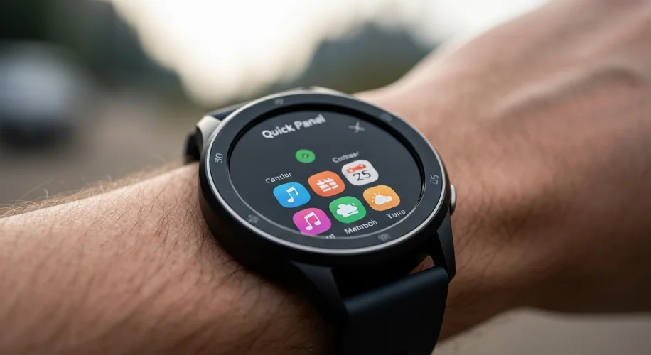
The new update in the One UI 8 beta introduces a revamped Quick Panel layout. Now, you can actually customize the order and even choose which quick toggles appear by default. This might sound small, but it’s a huge win for usability. I’ve been able to put my most-used settings right at the top, and honestly, it feels so much more intuitive.
Before this, it felt like I was constantly digging through menus. Now, the controls I need are literally at my fingertips, in the order I want them. It’s made interacting with my watch so much more efficient. I’m spending less time fiddling with settings and more time actually using the watch for what it’s designed for – quick info and tracking.
This isn’t just about aesthetics; it’s about how we interact with our wearables daily. Samsung focusing on user-centric design with this kind of customization shows they’re listening. It’s those seemingly small improvements that can genuinely enhance the overall experience. I’m really curious to see how this evolves, but for now, this simple tweak in the One UI 8 beta is exactly what I’ve been wanting for my Galaxy Watch.