
Hey creative crew!
Ever walk into a room and instantly feel a certain way? Or look at a painting and get hit with an emotion you can’t quite pinpoint? Chances are, color is doing some heavy lifting there. For me, as an artist (and someone who used to spend hours picking the perfect brand color for clients!), color isn’t just a pretty thing to look at. It’s a whole language. A really powerful one.
Today, I want to dive into something I think about a lot when I’m sketching out a new piece or mixing paints: color psychology. It’s basically the study of how colors affect human behavior and mood. Sounds deep, right? But it’s super practical, especially when you’re creating.
So, What’s the Big Deal with Colors and Moods?
Think about it:
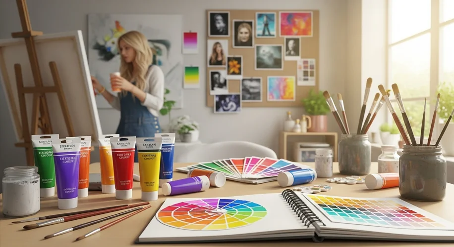
* Blues often bring a sense of calm, peace, or even a touch of melancholy. Like gazing at a vast, open sky or a tranquil lake. I lean into soft, muted blues when I want to evoke serenity in my prints – perfect for a cozy bedroom vibe.
* Greens scream nature, growth, and balance. They feel fresh and harmonious, like a walk through a quiet forest. If I’m painting something organic or trying to bring a feeling of renewal to a piece, green is my go-to.
* Yellows are bursts of sunshine! Joy, energy, optimism, sometimes even playful anxiety. I use bright yellows to add pops of cheer and life to a canvas, especially in abstract pieces that need a vibrant kick.
* Reds are intense. Passion, energy, love, urgency, or even anger. They grab your attention. When I want a piece to feel dynamic and powerful, a bold red is often the answer. It’s like a visual exclamation mark.
* Oranges are the warm, inviting friends of the palette. Enthusiasm, creativity, warmth, social vibes. Think cozy autumn leaves or a friendly campfire. I love using oranges to make a piece feel inviting and full of life.
* Purples often carry a regal, mysterious, or spiritual feel. They can be very calming, almost meditative, or deeply creative. When I’m trying to create something dreamy or introspective, deep purples often make their way in.
Of course, these are general vibes, and personal experiences can totally change how you see a color. But these associations are a great starting point.
How I Use Color to Create (and Shift) Moods in My Art
When I start a new piece for my Etsy shop or just for fun, I don’t just pick colors that “look good together.” I think about the feeling I want to leave with the viewer.
Let’s say I want to create a print that feels really soothing, something you’d hang in a space where you unwind. I immediately reach for those soft blues, greens, and creamy off-whites. I might even add a touch of pale pink for extra tenderness. It’s an intentional choice to create that calming atmosphere.
On the flip side, if I’m working on a more abstract painting and I want it to burst with energy, I’ll go for vibrant yellows, fiery oranges, and maybe some bold turquoise for contrast. These colors practically vibrate off the canvas, making the whole piece feel alive and active.
Sometimes, I even use color to shift my own mood while I’m painting. If I’m feeling a bit stuck or uninspired, just picking up a tube of bright cadmium yellow or a lively magenta can actually lift my spirits and get the creative juices flowing. It’s like a little visual pep talk!
Your Turn: Playing with Color Psychology in Your Own Creative Work
You don’t need to be painting masterpieces to use this. Here are a few simple ways to bring intentional color into your own DIY projects or creative endeavors:
- Start with an Emotion: Before you even pick up your supplies, ask yourself: What mood do I want this piece to evoke? Do I want it to feel joyful? Peaceful? Energetic? Mysterious? Let that feeling guide your palette choice.
- Create Color Mood Boards: Grab some magazine clippings, paint swatches, fabric scraps, or even digital images that represent the colors of a specific mood. This isn’t just about pretty pictures; it’s about building a visual library of emotions connected to color.
- Experiment Fearlessly: Don’t be afraid to try combinations that might seem “wrong” at first. What happens if you add a tiny pop of bright red to an otherwise serene blue and green piece? Sometimes the most surprising combinations create the most impactful feelings.
- Pay Attention to Your Surroundings: Notice how colors affect you in your daily life. Does that bright red coffee cup make you feel more alert? Does your blue living room feel calming? The more you observe, the more intuitive your color choices will become.
Color is such an incredible tool. It’s more than just what meets the eye; it’s a direct line to our emotions. So next time you’re creating, whether it’s a painting, a handmade card, or even just picking out your outfit, remember the powerful language of hues.
I’d love to hear how you use color to express yourself! Share your thoughts in the comments below.
Happy creating!
Warmly,
Anya